
Web & Browser
Designing Immersive UX for Mobile and Desktop
CipherRoot Software10 min read
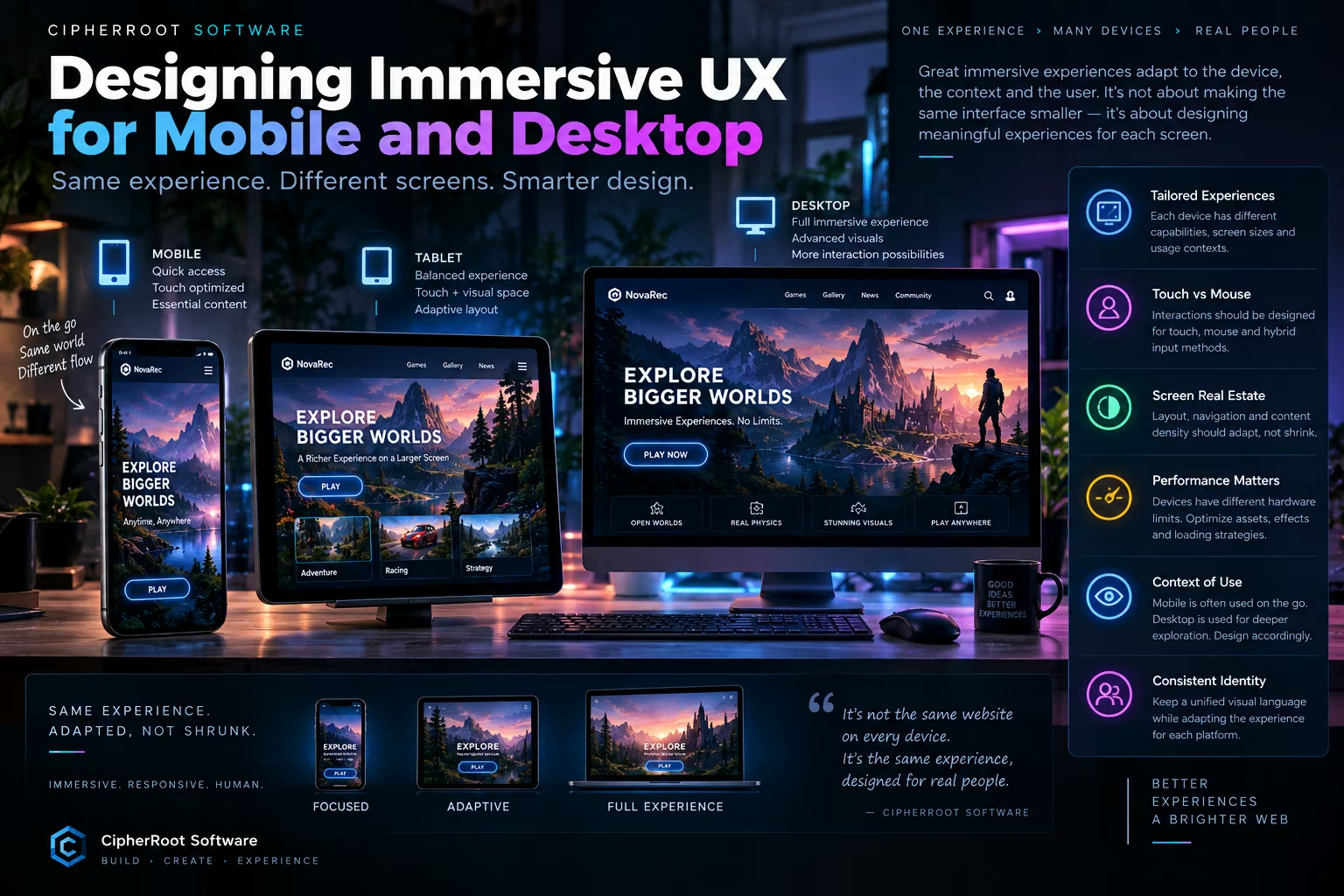
An immersive experience should not look exactly the same on every device.
A desktop monitor, tablet, and smartphone provide completely different amounts of screen space, interaction methods, hardware capabilities, and usage contexts. Simply shrinking a desktop interface until it fits on a phone may preserve the layout, but it does not necessarily preserve the quality of the experience.
This is why responsive immersive design requires more than responsive dimensions.
It requires adapting the experience itself.
One Experience, Different Devices
Traditional responsive design often follows a straightforward approach:
Desktop ↓ Tablet ↓ Mobile
The layout becomes narrower, columns collapse, text becomes smaller, and elements move into different positions.
This works well for many conventional websites.
Immersive experiences need an additional layer:
Desktop Experience ↓ Tablet Experience ↓ Mobile Experience
The visual identity can remain consistent, but the interaction model, visual complexity, navigation, and content density can change.
The goal is not to make three identical interfaces.
The goal is to create one coherent experience adapted to three environments.
Mobile Is Not a Small Desktop
One of the biggest mistakes in responsive design is treating mobile as a miniature desktop.
A desktop user may have:
A large monitor A mouse A keyboard Precise pointer control Significant screen space More available processing power
A mobile user may have:
A small touchscreen Finger-based interaction Limited screen space Variable network conditions Different hardware capabilities A very different usage context
These differences change the way an interface should behave.
A desktop interface might use:
Hover → Preview → Expand
while a mobile interface might use:
Tap → Reveal → Continue
The underlying content can remain the same.
The experience does not have to be identical.
Designing for Mobile First Interaction
Mobile interaction is primarily touch-based.
That changes fundamental UX decisions.
A hover effect cannot be relied upon because there is no persistent hover state on a typical touchscreen.
Small buttons can be difficult to use.
Dense navigation can become uncomfortable.
Large interactive scenes can become difficult to explore.
Immersive mobile design therefore needs deliberate touch interactions.
Useful patterns can include:
Tap
Reveal information, activate an element, or change the current state.
Swipe
Navigate between scenes, images, or content sections.
Drag
Move or manipulate interactive objects.
Pinch
Zoom into visual or 3D content when appropriate.
Long Press
Activate secondary functionality when the interaction is clearly communicated.
The objective is not to reproduce mouse interactions with touch.
It is to design interactions that feel native to the device.
Desktop Provides More Spatial Freedom
Desktop interfaces have more room to work with.
A wide monitor can support:
Multiple visual layers Larger navigation systems Detailed information panels Larger interactive scenes Side-by-side content More complex compositions
An immersive desktop experience can therefore take advantage of spatial relationships.
For example:
Navigation + Interactive Scene + Supporting Information + Secondary Controls
can coexist comfortably on a large screen.
On a mobile phone, the same structure may become:
Navigation ↓ Interactive Scene ↓ Primary Information ↓ Secondary Controls
The experience remains conceptually the same, but the composition changes.
Tablet: The Middle Ground
Tablet design is often overlooked.
It sits between desktop and mobile, but it is not simply a larger phone.
Tablets provide more screen space than phones while retaining touch-first interaction.
This creates interesting possibilities.
A tablet may support:
Larger visual scenes Expanded galleries More content beside interactive elements Multi-column layouts Touch-based exploration
while still requiring:
Large touch targets Gesture-friendly controls Simplified navigation Touch-aware interaction patterns
The tablet is therefore a separate design environment.
Screen Real Estate Changes Everything
One of the most important differences between devices is available screen real estate.
A desktop may provide enough space to display several levels of information simultaneously.
A mobile screen may require information to appear progressively.
For example:
Desktop [Navigation] [Visual Scene] [Details] Tablet [Navigation] [Visual Scene] [Details] Mobile [Navigation] [Visual Scene] [Primary Action] [Details] [Additional Information]
This is not a compromise.
It can actually create a more focused mobile experience.
Visual Complexity Should Adapt
Responsive design is not only about layout.
It should also consider visual complexity.
A desktop device may be able to handle:
More particles Higher-resolution textures More detailed 3D models More visual layers Complex background effects
A mobile device may benefit from:
Fewer particles Smaller textures Simplified visual effects Reduced 3D complexity Shorter animations
The system can preserve the same visual language while adjusting how much work the device needs to perform.
This can be represented as:
Device Capability ↓ Performance Profile ↓ Visual Complexity ↓ Experience
A powerful machine can receive a richer configuration.
A lower-powered device can receive a lighter version.
Responsive Immersive Design
Responsive immersive design combines two ideas:
Responsive Layout
and
Responsive Experience
Responsive layout determines where things go.
Responsive experience determines how things behave.
For example:
On desktop:
Hover ↓ Object highlights ↓ Information appears
On mobile:
Tap ↓ Object highlights ↓ Information appears
The visual result may be similar.
The interaction is different.
This distinction is essential when building immersive interfaces.
Navigation Should Adapt Too
Navigation is another area that often needs redesign rather than simple scaling.
A desktop website might use a horizontal navigation bar:
Home | Games | Apps | Blog | About | Contact
On mobile, that same navigation may become:
☰ Menu
But immersive navigation can go further.
Instead of simply hiding navigation behind a menu, the mobile experience can make the primary destinations immediately accessible while keeping secondary content inside a compact navigation system.
The key is to preserve discoverability.
Users should not have to search for basic functionality.
Content Density Matters
Desktop users can often handle more information at once.
Mobile users benefit from stronger prioritization.
This suggests a useful hierarchy:
Primary ↓ Secondary ↓ Optional
On a large screen, all three levels may be visible.
On a small screen, the interface can initially emphasize the primary content and reveal the secondary layers when requested.
This creates a clearer experience without removing important information.
Immersive Experiences Need Clear Focus
Visual richness can easily compete with usability.
This is particularly important on mobile screens, where there is less room for visual hierarchy.
An immersive interface should establish a clear focal point.
For example:
Hero visual → Primary action → Supporting information
rather than:
Hero visual + five animations + multiple controls + competing messages
Immersion should guide attention.
It should not scatter it.
Animation Must Adapt to Context
Animations can also behave differently depending on the device.
A desktop transition might use a longer cinematic movement.
A mobile version may use a shorter transition to reduce processing and maintain responsiveness.
The goal is not necessarily to eliminate animation on mobile.
Instead, it can be simplified and optimized.
For example:
Desktop Detailed transition Multiple visual layers Longer motion sequence
Mobile Short transition Fewer layers Simplified motion
The identity remains consistent while the technical cost changes.
Performance Is Part of Responsive UX
A responsive experience is not truly responsive if it becomes slow on mobile.
Performance therefore needs to be considered alongside interaction and layout.
Important strategies include:
Optimized image formats Lazy loading Responsive image sizes Efficient animation Optimized 3D assets Reduced rendering complexity Progressive initialization Device-aware visual quality
The goal is simple:
The interface should respond as quickly as the user expects.
A beautiful animation that takes too long to start can feel less immersive than a simpler animation that responds immediately.
Designing for Different Usage Contexts
Device type is only part of the story.
The context of use also matters.
A desktop user may be sitting at a workstation and exploring a product for several minutes.
A mobile user may be:
Walking Waiting Traveling Browsing quickly Using a mobile network Holding the device with one hand
These situations influence design decisions.
Desktop experiences can encourage deeper exploration.
Mobile experiences often benefit from immediate access to important actions and concise interactions.
The same content can support both contexts without forcing the same interaction model.
Consistent Identity, Adaptive Experience
A major challenge is keeping the experience recognizable across devices.
The mobile version should not look like a completely different website.
The visual identity should remain connected through:
Typography Branding Color language Image style Component design Motion principles Content hierarchy
At the same time, layout and interaction can change.
This creates an important distinction:
The identity stays consistent. The experience adapts.
Testing Real Devices
Responsive design cannot be evaluated only by resizing a desktop browser window.
Real devices introduce differences that simulations may not fully reproduce.
Testing should include:
Mobile Phones
Different screen sizes, aspect ratios, touch behavior, and hardware levels.
Tablets
Touch interaction combined with a larger display.
Desktop
Large screens, mouse interactions, keyboard input, and higher visual capacity.
Testing should evaluate more than appearance.
Check:
Can users navigate?
Are controls easy to reach?
Does the experience remain responsive?
Do visual effects remain smooth?
Does content remain readable?
Does the layout remain stable?
These questions are more important than whether every device looks identical.
A Device-Aware Experience Architecture
The Immersive Experience Engine can treat the device as part of the environment.
A simplified architecture could be:
User ↓ Device Detection ↓ ┌──────────┴──────────┐ ↓ ↓ Interaction Profile Performance Profile ↓ ↓ └──────────┬──────────┘ ↓ Experience Logic ↓ Visual + Content Layers ↓ Adaptive Experience
This allows the system to make informed decisions about how the experience should behave.
The device does not determine the entire design.
It simply provides information that helps the experience adapt.
Same Experience. Different Flow.
Imagine a fictional immersive product page.
On desktop, the visitor might:
Explore → Rotate → Compare → Read Details → Purchase
On mobile, the same journey might become:
Explore → Tap → Swipe → Read → Continue
The destination remains the same.
The journey changes to match the device.
This is one of the central principles of responsive immersive UX.
What Not to Do
There are several common mistakes worth avoiding.
Simply Shrink the Desktop Interface
Smaller elements do not automatically become better mobile controls.
Keep Every Visual Effect
Some effects may provide little value on small screens while consuming significant resources.
Depend on Hover
Touch interfaces cannot rely on persistent mouse hover.
Ignore Performance
Heavy assets can make a visually impressive mobile page frustrating to use.
Hide Too Much
Over-simplification can make important features difficult to discover.
Create Completely Separate Designs
A completely different mobile experience can break brand consistency and increase maintenance complexity.
The better approach is to create a shared design language with adaptive behavior.
The Principle of Adaptive Immersion
Responsive immersive design can be summarized in one principle:
Same Vision ↓ Different Devices ↓ Adaptive Layout ↓ Adaptive Interaction ↓ Adaptive Performance ↓ One Coherent Experience
A desktop monitor should not dictate how a mobile phone behaves.
A mobile screen should not limit what a desktop experience can become.
Each device should receive the version of the experience that makes the most sense for its environment.
The Future of Multi-Device Experiences
As browsers and devices become more capable, immersive experiences will increasingly span multiple environments.
A user may discover a project on a phone, explore it on a tablet, and return later on a desktop.
Consistency becomes important.
The experience should feel familiar without being identical.
This creates an opportunity for designers and developers to move beyond traditional responsive layouts toward adaptive digital environments.
Conclusion
Designing immersive UX for mobile and desktop is not about shrinking one interface until it fits everywhere.
It is about understanding that different devices create different opportunities and constraints.
Desktop provides space and precision.
Tablet provides touch interaction with a larger visual canvas.
Mobile requires focused layouts, touch-friendly controls, careful performance management, and context-aware interaction.
The most effective approach is therefore:
Same experience. Different implementation.
The visual identity remains consistent.
The interaction adapts.
The content hierarchy adapts.
The visual complexity adapts.
The performance strategy adapts.
And the result is a digital experience designed for the person using it — regardless of the screen in their hands.
Same experience. Adapted, not shrunk.